Avatar
Avatar can be used to show user's profile picture on profile information page, on navigation bar, in blogs grid items.
<div>
    <img class="avatar" src="./assets/avatar.jpg" />
</div>

<div>
    <img class="avatar-lg" src="./assets/avatar.jpg" />
</div>
 5
6
5
6
 7
7
<div>
    <img class="avatar" src="./assets/avatar2.jpg" />
    <span class="badge">5</span>
</div>
<div>
    <img class="avatar-lg" src="./assets/avatar2.jpg" />
    <span class="badge-lg">6</span>
</div>
<div>
    <img class="avatar-lg" src="assets/avatar2.jpg" />
    <span class="badge-lg">7</span>
</div>
<div>
    <i class="fas fa-envelope-open-text fa-3x avatar"></i>
    <span class="badge">8</span>
</div>
Typography
Don't waste time deciding on the sizes and styling of you content, this component provides well tested, out of the box typographic styles.
Use typography to present your design and content as clearly and efficiently as possible.
H1 - Heading
H2 - Heading
H3 - Heading
H4 - Heading
H5 - Heading
H6 - Heading
<h1>H1 - Heading</h1>
<h2>H2 - Heading</h2>
<h3>H3 - Heading</h3>
<h4>H4 - Heading</h4>
<h5>H5 - Heading</h5>
<h6>H6 - Heading</h6>
Text Utilites
You can highlight text using the highlight class
Strike thorugh text using the strikthrough class
Text with light font weight
Text with bold font weight
Text small
Text with primary color
<p>
    You can
    <span class="highlight">highlight</span> text using
    the highlight class
</p>
<p class="strike-through">
    Strike thorugh text using the strikthrough class
</p>
<p class="light-font-weight">
    Text with light font weight
</p>
<p class="bold-font-weight">
    Text with bold font weight
</p>
<p class="text-small-size">Text small</p>
<p class="primary-text-color">
    Text with primary color
</p>
Loader
Loader is used when something is processing that takes times, like network requests etc.
<div class="loader"></div>
Rating
<div class="rating">
    <span>5</span>
    <span><i class="fas fa-star fa-sm"></i></span>
</div>
<div class="rating rating-green">
    <span>4.5</span>
    <span><i class="fas fa-star fa-sm"></i></span>
</div>
Image
Makes images can be responsive to fit the parent's width.

<img class="image-responsive" src="./assets/landscape.jpg"/>
Card
Cards are used to show user related data collectively, like product details.
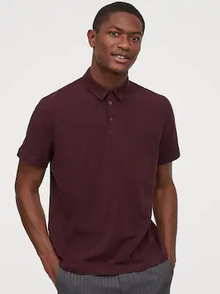
H&M
Men Polo Shirt Slim Fit
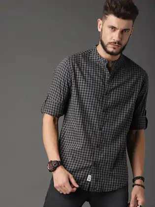
Roadster
Men Micro Check Shirt